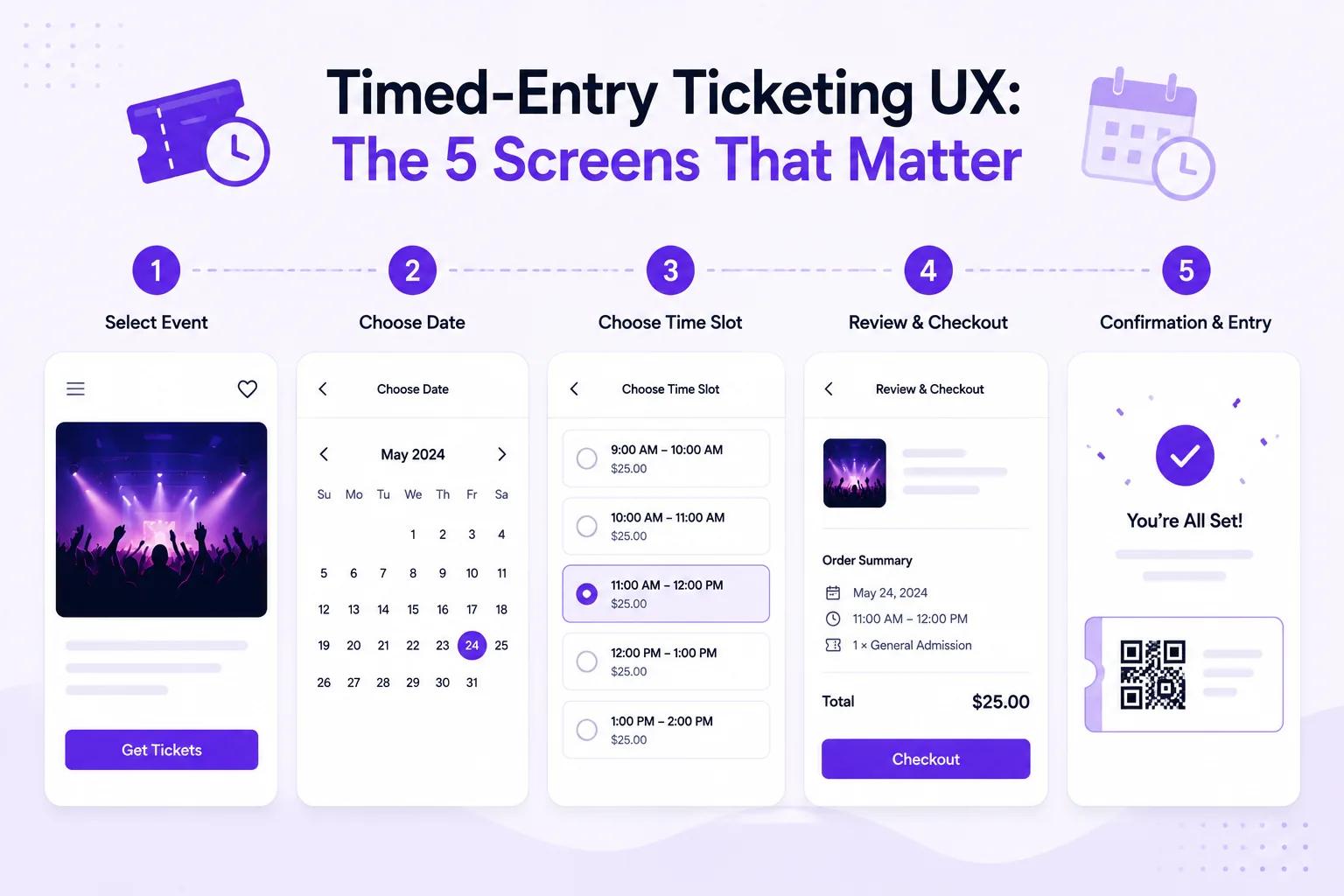
A visitor needs to understand three things before paying: which day they are visiting, when they can arrive and what their ticket includes. Each screen should carry those choices forward without making them start again.
This is a design checklist, not a feature list. For Ticket Spot’s schedule setup, capacity limits and plan costs, see timed entry ticketing. Selling through a store? Use the Shopify timed-entry guide.
Screen 1: Date and time selection
Put the date above the time slots and keep it visible when a visitor changes their selection. Label the time zone where visitors could reasonably be booking from elsewhere.
Show the information needed to choose:
- Available arrival windows, with an explicit selected state.
- The price before checkout, including differences between dates or ticket types.
- An explanation of what the window means: arrival at a particular time, or a session with a fixed end.
- A clear sold-out state and a way to choose another date.
Use text as well as color for availability. “Sold out” is understandable without knowing what gray means. Any remaining-place count must reflect actual availability; avoid manufactured urgency.
On mobile, test the longest time label and the busiest date. A small calendar that looks neat on desktop may force visitors to zoom or tap the wrong day. Keep selected values when someone goes back from checkout.
Screen 2: Ticket types and attendee details
Explain who each ticket is for. “Child, ages 5–12” is more useful than “Concession” when visitors are booking for a family. Put quantity and the running total beside the selection.
If you offer group tickets, say how many people one ticket admits. A booking for four people should not accidentally become four family passes. Also explain whether accompanying adults or very young children need a ticket.
Ask only for details you need to run the visit. Separate the purchaser’s contact details from information about individual attendees. Test a two-person booking with different answers to make sure the records remain distinguishable.
Offer relevant add-ons without obscuring the admission choice. An optional workshop needs its own date, time and capacity explanation if it is separate from the main visit. Do not imply that buying admission guarantees access to every activity.
Screen 3: Checkout
Repeat the date, arrival window, ticket types, quantities and total immediately before payment. A visitor should be able to correct the time without rebuilding the whole order.
Make the full price visible before the final confirmation. Clearly distinguish ticket prices, taxes and any service charges. Test the payment methods actually available on your storefront rather than showing logos for methods your setup does not accept.
For Shopify, test the ticket selection and checkout path on your real theme, including a cart containing both tickets and merchandise.
A custom domain can keep the experience visually consistent. It is not a guarantee of a particular conversion improvement. Measure completed bookings against checkout starts before and after changing the flow.
Screen 4: Confirmation and ticket delivery
The confirmation should answer “Am I booked?” and “What do I do next?” Show:
- The confirmed date and arrival window.
- How to open or download the ticket and its QR code.
- Venue address, arrival instructions and accessibility information.
- The late-arrival, cancellation and booking-change policies.
- A contact route if the ticket email does not arrive.
Where wallet passes are available, offer them alongside the PDF ticket. Check the pass on a real device; do not promise lock-screen reminders or location behavior without testing that configuration.
For group bookings, explain whether each attendee needs a separate ticket and how the purchaser should share them. Test delivery to a second email account, not just the account used to set up the event.
Screen 5: Admission at the venue
The booking flow finishes at the entrance. Test your tickets where staff will actually scan them, using the devices and network available on the day.
Your rehearsal should include a valid ticket, an already-used ticket, a refunded ticket, a ticket for another window and a visitor without their email. Confirm the relevant check-in settings and plan before relying on a particular rejection rule.
Ticket Spot uses a live connection for ticket validation. Check connectivity at each entrance and agree an operational fallback with your team if it becomes unavailable. Do not assume an offline device has a current guest list.
Write the late-arrival policy before opening sales. Moving someone into a later window can affect that window’s capacity; the earlier reservation does not mean there is room later. Staff need a consistent process for exceptions and rebooking.
Arrival capacity is not live occupancy. Visitors from previous windows may still be inside. Account for visit duration, overlapping groups, exits and the venue’s occupancy limit separately. Ticket sales or entry scans alone do not tell you how many people remain in the building.
Test the whole journey before launch
Run these checks on desktop and a small phone:
- Select a date, time and two different ticket types; go back and confirm the choices remain correct.
- Check the last available place and what happens when a window sells out.
- Complete a purchase and compare the selected date and time with the order, email and ticket.
- Test group attendee details, optional extras and the total charged.
- Scan the ticket at the venue and rehearse the exception cases above.
These checks reveal practical problems before visitors encounter them. They do not establish a conversion lift or a reduction in no-shows; those need your own booking and attendance data.
For the product setup, start with Ticket Spot timed entry ticketing. For recurring lessons rather than admission windows, see classes and workshops.