Timed-entry ticketing isn't just for museums anymore. Parks, tours, attractions, pop-ups, and even retail experiences use time slots to manage capacity, reduce crowding, and create a better visitor experience.
But the attendee experience lives or dies on five screens. Get them right, and visitors breeze from selection to entry. Get them wrong, and you get confused buyers, crowded entry points, and no-shows in one slot while the next sits empty.
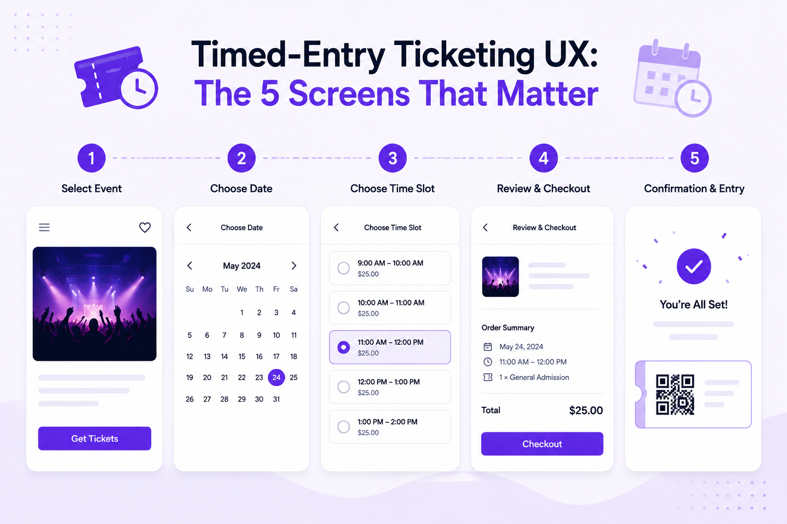
Here are the 5 screens that define timed-entry ticketing — and how to design each one for maximum conversion and smooth operations.
Screen 1: Time Slot Selection
This is where the attendee chooses their entry window. It's the most critical screen in the entire flow.
What It Needs to Show
- Available time slots with clear availability indicators
- Pricing per slot (if prices vary by time — e.g., peak vs. off-peak)
- Capacity remaining per slot (e.g., "12 spots left" or "Almost full")
- Date picker for multi-day operations
- Clear visual hierarchy — the available slots should be the most prominent element
Design Principles
Show scarcity honestly. If a slot has 5 spots left, say so. This creates healthy urgency and helps attendees choose less-crowded times. But never fake scarcity — attendees notice and it erodes trust.
Default to the next available slot. Don't make them scroll past sold-out times to find an opening. Highlight the next available slot automatically.
Color-code availability:
- Green: 50%+ capacity remaining
- Yellow: 25-50% remaining
- Red: Less than 25% remaining ("Almost full")
- Gray: Sold out (still visible so attendees know popular times exist)
Make peak vs. off-peak pricing obvious. If Saturday 10am costs more than Tuesday 2pm, show this clearly on the selection screen — not as a surprise at checkout.
Common Mistakes
- Hiding sold-out slots entirely (attendees wonder if the event is real)
- Requiring account creation before showing availability (huge drop-off point)
- Not showing the date context (attendees select 2pm but don't realize it's the wrong date)
- Tiny calendar widgets on mobile (frustrating tap targets)
Screen 2: Ticket Type & Add-Ons
After selecting a time slot, the attendee chooses their ticket type and any extras.
What It Needs to Show
- Ticket types — General Admission, Adult/Child/Senior, Member/Non-Member
- Add-on experiences — Audio guide, behind-the-scenes tour, gift shop credit
- Group options — Family pack (2 adults + 2 kids), group discount (10+)
- Running total — Always visible, updating in real time as they add items
Design Principles
Lead with the most popular option. If 80% of visitors choose General Admission, make that the default selection. Don't force everyone to evaluate 5 ticket types.
Show add-ons contextually. If someone selects the "Museum Highlights Tour" time slot, show the audio guide add-on prominently. If they selected "Free Exploration," show the map and guidebook add-on instead.
Family packs increase average order value by 30-40%. Bundle adult + child tickets at a discount. This reduces decision complexity and increases revenue.
Don't overwhelm with options. More than 4-5 add-ons creates decision paralysis. Show the top 3-4 most relevant ones, with a "More options" link for the rest.
Screen 3: Checkout
The payment screen. This is where most ticketing platforms lose 20-30% of buyers.
What It Needs to Show
- Order summary — Date, time slot, ticket type, quantity, add-ons, total
- Payment options — Credit card, Apple Pay, Google Pay, PayPal
- Promo code field — Collapsed by default, expandable
- No surprise fees — Total should match what was displayed on Screen 2
Design Principles
Eliminate fee surprises. The #1 reason for checkout abandonment is a higher-than-expected total. Ticket Spot's 0% platform fees mean you don't have to pass hidden costs to attendees. If you charge a service fee, show it on Screen 1 — not here.
Support express checkout. Apple Pay and Google Pay reduce checkout time from 60+ seconds to 10 seconds. For time-slot purchases (often mobile, often impulse), this matters enormously.
Show the time slot prominently in the summary. Attendees are buying a specific time, not just a ticket. Reinforce: "Saturday, July 12 — 10:00 AM Entry" at the top of the checkout summary.
One-page checkout. Don't split payment and contact info across multiple pages. Every page transition is a drop-off point.
Custom Domain Advantage
With custom domain ticketing, the checkout page stays on your website. Attendees see your URL, your branding, and your SSL certificate. This reduces checkout abandonment by 15-25% compared to third-party redirect checkout.
Screen 4: Confirmation & Ticket Delivery
The attendee has paid. Now they need proof — and instructions.
What It Needs to Show
- Confirmed date and time slot — Bold, unmissable
- QR code ticket — For entry scanning
- Apple Wallet / Google Wallet button — One-tap addition
- Add to calendar button — One-tap event creation
- Venue details — Address, parking, transit, what to bring
- Modification/cancellation policy — Clear rules upfront
Design Principles
Deliver the ticket instantly. No "within 24 hours" delays. The PDF and QR code should appear on-screen immediately after payment, plus an email with the same content.
Push Apple Wallet aggressively. Attendees who add the ticket to Apple Wallet get:
- A lock screen notification on the day of the event
- The QR code accessible without opening any app
- Location-aware display when they're near the venue
This single feature reduces no-shows by 10-15% with zero ongoing effort.
Show the time slot in every confirmation touchpoint. Confirmation email subject line: "Confirmed: [Attraction Name] — Saturday, July 12 at 10:00 AM." Not just "Your ticket confirmation."
Include a "Share" button. Group visits often have one person buying for everyone. Make it easy to forward tickets to the rest of the group.
Screen 5: Day-of Entry Experience
The attendee arrives at the venue. This isn't a screen they see on your website — it's the physical experience that your ticketing system enables.
What It Needs to Enable
- Frictionless scanning — QR code scans in under 2 seconds
- Offline validation — Works even if the venue's Wi-Fi is down
- Visual capacity awareness — Staff can see how many people have entered each time slot
- Late arrival handling — Clear policy for attendees who miss their slot
- Re-entry — If visitors can leave and return, a smooth mechanism for tracking
Design Principles
Separate entry lanes by time slot. If your 10am and 11am entries overlap at the gate, have separate lines. This prevents the 11am crowd from blocking the 10am check-in.
Use offline check-in. Venues with timed entry are often museums, parks, or historic buildings — places with terrible Wi-Fi. Use Ticket Spot's offline check-in mode to avoid connectivity dependency.
Handle late arrivals gracefully. If someone booked 10am but arrives at 10:45am:
- Option A: Let them in (simplest, best experience)
- Option B: Offer the next available slot (stricter capacity management)
- Option C: Deny entry, offer rebooking (strictest, worst experience)
Most venues choose Option A. The slot is already accounted for in capacity — turning them away wastes the reservation and creates a negative experience.
Display real-time capacity. If you have a digital sign or app, show current attendance vs. capacity. "Currently 120 visitors inside — comfortable capacity." This helps visitors self-regulate their timing.
Timed-Entry Pricing Strategies
Peak / Off-Peak Pricing
Charge more for popular times:
| Time Slot | Pricing Tier | Price |
|---|---|---|
| 9:00 AM | Off-peak | $18 |
| 10:00 AM | Peak | $25 |
| 11:00 AM | Peak | $25 |
| 12:00 PM | Standard | $22 |
| 1:00 PM | Off-peak | $18 |
| 2:00 PM | Off-peak | $18 |
| 3:00 PM | Standard | $22 |
This naturally spreads demand across the day, reducing peak crowding while increasing revenue from popular slots.
Dynamic Pricing
For high-demand attractions, adjust prices based on real-time availability:
- When a slot is 90%+ sold, raise the price by 10-15%
- When a slot is under 30% sold, offer a "Last-minute discount"
- This maximizes revenue and fills capacity simultaneously
Bundle Pricing
Offer timed-entry + add-on bundles:
- "Guided Experience" — Timed entry + audio guide + map: $35 (vs. $43 separately)
- "Family Adventure" — 2 adult + 2 child timed entries + activity booklet: $65 (vs. $82 separately)
Bundles increase average order value while simplifying the decision process.
Industries That Benefit from Timed Entry
- Museums & Galleries — Spread visitor flow, protect sensitive exhibits
- Parks & Recreation — Season passes and timed entry for trails, pools, and attractions
- Tours & Experiences — Fixed departure times with capacity limits
- Pop-Up Events — Limited run, controlled capacity, high demand
- Escape Rooms — Precise time slots, no walk-ins
- Aquariums & Zoos — Manage animal viewing areas and feeding times
Ticket Spot for Timed-Entry Ticketing
- Flexible time slots — Create any schedule: hourly, 90-minute windows, or custom intervals
- Per-slot capacity — Set maximum attendees per time slot
- Waitlist per slot — Auto-fill cancellations from the waitlist
- 0% platform fees — Keep all ticket revenue
- Custom domain — Sell on your website, not a third-party platform
- Klaviyo integration — Automated reminders specific to the ticketed time slot
- Apple Wallet passes — Lock screen reminders on the day of entry
- Offline check-in — Validate tickets without Wi-Fi
Get Started with Timed-Entry Ticketing
Design the 5 screens right, and your visitors go from browsing to booked in under 90 seconds.
Questions about timed-entry setup? Email support@ticketspotapp.com.